Environment Background

Jamie Ashbolt.


The final piece of work that had to be done was the creation of a background for the game, though we could have gone with a simple single tone colour, I and the rest of the group felt it would look much better if their was something and so I started to think about how to create the background.

Group_Project_BackGround_4k

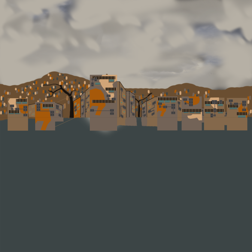
Firstly I started with the frontal buildings within the background, these were to be of varying heights to give the impression that the place was not of the same single height and felt more like a town or city that over the years had expanded like a settlement does, taking what I learned from creating the tiles i kept to a uniform look, reusing parts like pipes and windows to ensure it fits with the tileset and ensures conformity is maintained between the assets.

Next I started to experiment with depth drawing, so as the image expands backwards the parts to it start to shrink and lose detail till they are pretty much just lines right in the back of the background, I also raised the background up giving a few hills for which the town can grow up and over which as its drawing inspiration from shanty towns fits the general idea of how they work.

Then I worked upon the sky, using a mixer of different colours and patterns to help give it a cloudy look which could be seen as why he is running across the roof tops, attempting to get home or maybe even outrun the rain or so the player could think, it also helps with fitting the atmosphere of the game and works well with the general look of the environment.

Group_Project_BackGround_Half_Size_4k

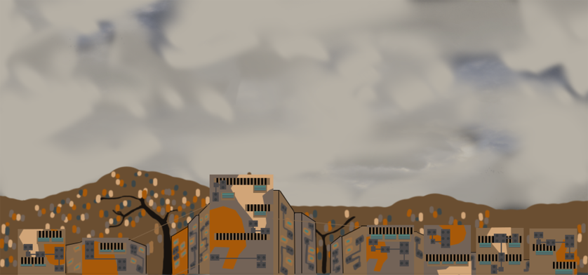
Finally I cropped the image to remove all of the unneeded clutter at the bottom, and increased the size of the image to a 4k resolution to ensure that no quality is lost when it is imported into the game engine and shrunken down to fit the game.

Game App Icon

-Sean

Another piece of media that was needed was the app icon. This piece of media is the first thing the audience will see of our game on the market so a first impression is crucial, in attracting a potential audience in to downloading the finished product.

To do this I followed designs similar to most apps on the market, by using Illustrator i created a rounded square shape and added a blue gradient, expanded from the centre, and placed a lighter shade of blue of a circle on top and deleted half of it to fit into the square and still show the other shade, also lowering, this now semi circles, transparency and. I also layered a grey square layer underneath the blue and set the gradient to the left to go lighter into a silver to add a metal effect that some apps on the app market are implementing into their designs.

I used The initial Design of the main character, on which Daniel Cobb designed, as the representation of the game as it shows of the main character and is fit for purpose, many games such as cut the rope, and angry birds, use the mascots as the main display on their app icons and i chose to follow a similar design

icon

Environmental Design, Kill boxes.

Jamie Ashbolt


For the game their are these kill boxes that the player has to either jump or slide under or else they will hit them and the game will end, currently it’s just a simple red box but over the course of a few days I was able to create a little sprite to replace the box.

Garbage-Scawle-(Kill-Object)

It’s design was fairly simple, to keep it small and fairly ugly but at the same time, make it so that the player as they run though can notice it quickly, but it also had to make sense as to why it was floating within the air at times and so I thought up the idea of having a hovering Garbage Scawle to represent the kill box.

This allows for the ability to place objects around it that can be seen as jagged metal objects which stick out in odd ways and generally make it seem not entirely friendly, as intended but it also shows more about the game, with how the robots are constantly having to take the scraps that fall of the buildings and are generally laying around to a place where they can be reused or refurbished if it is possible, thus reinforcing the idea that the area is run down or very weathered depending upon the person’s perspective.

Character Animations and Programming

-Daniel Cobb

I have created the animation for the robot character in a program called Spine. It makes creating 2D animations simple with a skeleton system and other advanced features to bring 2D characters to life. In this case I only used the basic features of the program to pose the character into keyposes for running and jumping animations. Once the animations were finished they were exported as seperate images and put into a sprite sheet in photoshop.

Spine Image.jpg

Sprite Sheet.png

I have also taken over responsibility for the programming of the game. So far I have created random platform selection that spawns them at different heights and distances from each other.

The character constantly runs to the right of the screen and has a variable jump height, the longer you hold jump the higher you go. A video of the game so far can be seen below.

Environmental Design Final Tiles.

Jamie Ashbolt.


Due to being able to reuse parts from previous tiles I was able to complete a large number of them for use within the game, each being fairly different from one another even though they tend to use several objects from previous ones.

As the two larger tiles show they are the same just reversed, but this simple little tweak allows for another tile that looks different enough that a person would not notice the simple switch.

A prominent use in each of the tiles is the use of pipes and ventilation boxes that jut out everywhere, this helps to make the tile seem more cluttered and a hodge podge of different ends and sections that help to make the tile seem weathered and pretty old, which seeing how the game is set in a semi-future time period and set within a shanty town helps to reinforce that its not going to be using a large number of older parts and building materials that the robots can get their hands on.

to help with this I tried experimenting with some tiles that had large amounts of rust over them, this did not work out that well outside of the image above on the left which I felt was the only good one that was created but it does the job that is required.

Finished Character

– Daniel Cobb

In the last two weeks I have finished creating the character in Adobe Illustrator. I used the same process of creating shapes with the pen tool; adding in shading and rusted areas in the same manner and finally adding some details like scratches and dents with the line tool and using the width tool on circles to create the dent effect.

Final Image for blog

Next I will be saving lower/upper arms and legs into different PNGs and taking them into an animation software called “Spine”.

Environmental Design – Update.

Jamie Ashbolt.

Over the past few weeks I have been getting use to the program Adobe Illustrations, the tools for it are pretty good but it can get a little confusing at times when attempting to find the correct tool or option, but the benefits for what it provides can be seen pretty nicely.

Stepping away from the more realistic art style for the more cartoony one we had in mind, was a little tricky but after doing a few tiles I started to get use to it and improve upon the tiles afterwards, But I also started to use parts I had already created in future tiles, this allows me to create more diverse tiles but at the same time have parts that help to ensure that each shares similar traits.


the use of the window area has also helped to keep each of the tiles diverse and make them feel more alive as the player runs along the top of them.

Environmental Design Progress.

Jamie Ashbolt-


after finishing the initial design we decided to change how the art would look form the more realistic sort of design to a more cartoony one, this has led to having to redo the art but that is ok, with the number of errors in the previous image to start afresh with using it as a template has allowed for me to remake it in a fairly short time.

ground-tilesets_update

The first image shows a mix of the older tileset and the newer one (Note the differences in the edges and how more pronounced they look) the use of adobe illustrator has helped with making these parts stand out more.

Along with a new art style I reduced the size of the tile to the one that is going to be used (60pt x 60pt) from a much larger resolution  this made a large number of the changes balloon to extreme sizes and required me to re tweak them so that they would fit.

ground-tilesets_update_2

After that I reduced the number of items on the tile and started to focus on a smaller scale with single large parts added onto it with more basic backgrounds.

Power-up asset Design

-Sean

The design for power-ups was quite difficult as making something that is creatively unique and is fit for purpose i found challenging.

unfortunately we are not going to have as many power ups as initially planned due to team difficulties, with now only having three members. This is to lessen the work load and ultimately still meet what we initially envisioned, from our pitch.

I once again wanted to use a transparent bubble style for similar reasons as previously stated with the score icon, in that it would not distract the players view and not take away attention from the background or any other assets.

The first design had to be for a score multiplier, which I found hard to design from a creative stand point rather than just placing a X-2 , in bold black lettering and moving on and going to the next asset. To add some creative flare, to something simple i used illustrators pen tool to draw the lettering design of the X making one line bigger than the other and layering it on top of the smaller line. I then took the design of the games restart button and started adding lights, similar to the main characters eyes and bronzed the X and adding lines connecting then reminiscent of circuitry. I also then, took the same progress towards the 2.

As for the power-up which purpose is to halt the spawning of the “death blocks”, I found especially difficult to even concept a design that was unique and conveys the purpose to the player. I had such difficulty with this my other team members suggested doing a stop sign with a design similar to my others. We agreed that this was the best course of action with our time frame, to just be focusing on the design for a one asset, but if another design could be thought of by any of us we would take it further